Posts

Showing posts from November, 2017

The Wizard of Oz poster

Image
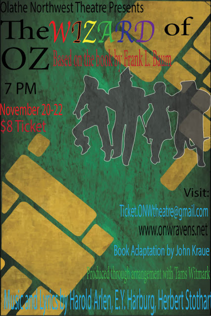
Contrast: The most important things I did to get the viewers eye is color the title, give credit to the original author in the top, all schools info at the bottom, give the performance date and cost of ticket under title along with the image of the characters. Alignment: The way I aligned the poster is title and original author at the top, The time and date of performance and ticket cost under the title next to the picture, and at the bottom the school email and information. Repetition; One repeated concept I did was color some of the text to make it more readable to the viewers eye. and placed the more important info at the top and less important at the bottom. Proximity: For grouping I gave two groups to the important and less important information. for important it was the title, date, time, original author, and cost per ticket. The less important info was the school information, email, producers, music instructors, and the blog.
Image
in this project we had to show the different types of typography in our names. We had to find ten types some of the letters in my name had more than one type. There were some mistakes made but fixed. part of this project had me go back to the example and look to find what type of typography was in the body shape of my name. this was a confusing project but the more you learn. I do look forward to the next but I hope it will not be asa ahead as this one was. I still have to learn how to used adobe illustrator but it might get easier to use for the next. graphic design is getting easier and it will prepare for the next project.
Image
logo colors Analogous This logo uses the analogous colors of yellow and green. I think this company used these colors because this group supports life and uses tools and recesses to make sure that it stays the same and no effect takes place. This logo uses the analogous colors of blue and purple. I think this group used this logo because they help others to support and help the environment to make it a better place. Complementary This logo uses the complementary colors greensand red. I think the creators of this drinkused these colors for their logo because of the excitement and joy of this soda drink to be shared to both adults and children. This logo uses the complementary logos blue and orange. I think the company used these color because it shows websites to tech you new things and learn a lot of happy and upsetting news. Warm This logo uses the warm colors yellow and black. I think this logo used these colors because of the fact that it is a war between l